
OxygenLevel 1000ma
This graph represents the concentration of oxygen in the atmosphere over the last 1000 million years. As a reference, the dashed red line shows the present concentration of 21%. It should be noted that the O2 concentration variation which occurred in past periods can often be estimated only relatively coarsely. Therefore, the chart makes no claim to accuracy, but can only give a broad overview of change at the level of geological periods. This chart is based on the averaged data of several publications. [1][2] Explanation of the curve: After having already begun in the Precambrian, the outgassing of oxygen from the oceans caused atmospheric oxygen to jump from 3% to 12% around the beginning of the Cambrian, because by then all oxygen sinks were finally saturated. Around the same time,...

Related Vectors

Red Panda
by

Red Panda
by

Red Panda
by

CheonIlGuk 8 ryeon Cheol ryeok 03 wol 01 il (March 24, 2020) 9:12AM magnolia flowers
by
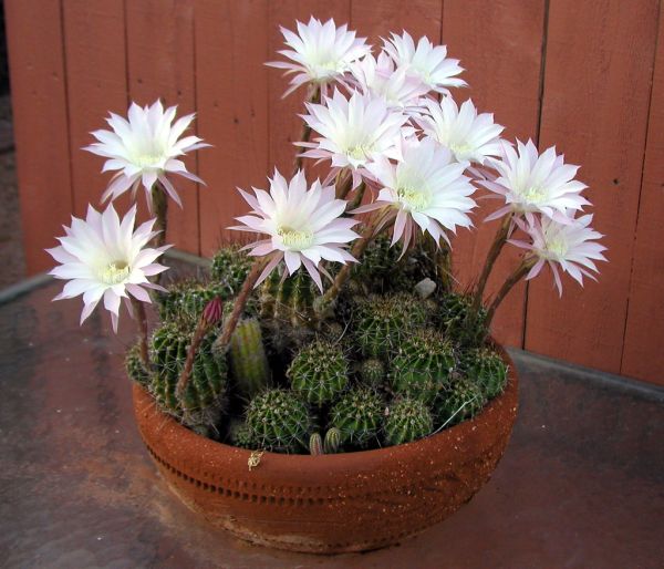
Amazing White Cactus Flowers
by
DSCF4757
by
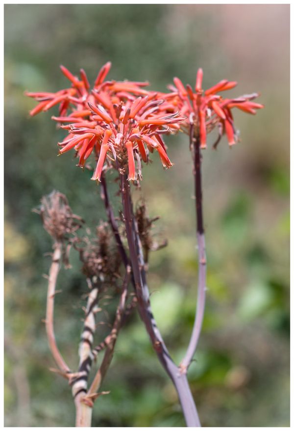
Aloe
by

Paper Kite.Malaysia.
by
Owl butterfly. (Caligo memnon)
by

Animal Cell Structure En
by

Surfer Wave
by

Hanafuda January Hikari
by

Seal Of Florida
by

Differences Between Simple Animal And Plant Cells (blank)
by

Planta De Santa María Del Naranco Vectorized
by

Weatheringcartoon
by

Coat Of Arms Of Canada Rendition
by

Reichskanzlei Fuehrerbunker
by

Mauna Loa CO2 Monthly Mean Concentration
by

Carbon Sequestration 2009 10 07
by

Tchernobyl Radiation 1996 It
by

Emblem Of Mangkunagaran
by

WGSRPD Malesia
by

Simple Micropropagation Technique
by

Wappen Rosenow
by

Rosy Cross
by

Heraldisch Lippische Rose
by

Lippische Rose
by

20241206 Grid Energy Storage
by

Nitrogen Fixation Fabaceae En
by

Conceptual Diagram Example
by

Mycorrhizal Network
by

Bandeira Do Distrito Federal (Brasil) (1891–1960)
by

Leaf Tissue Structure Zh
by

Potetometer
by

Chloroplast Diagram Sr
by
Comments (0)
Login to comment